The Greenville Community Water Corps has been working on projects tackling different areas of community concern in Greenville, NC.
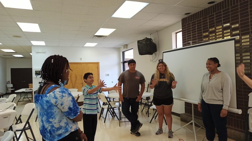
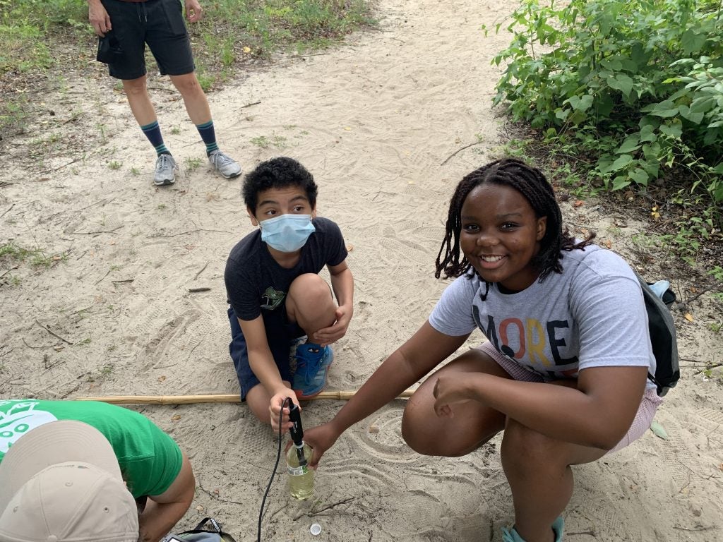
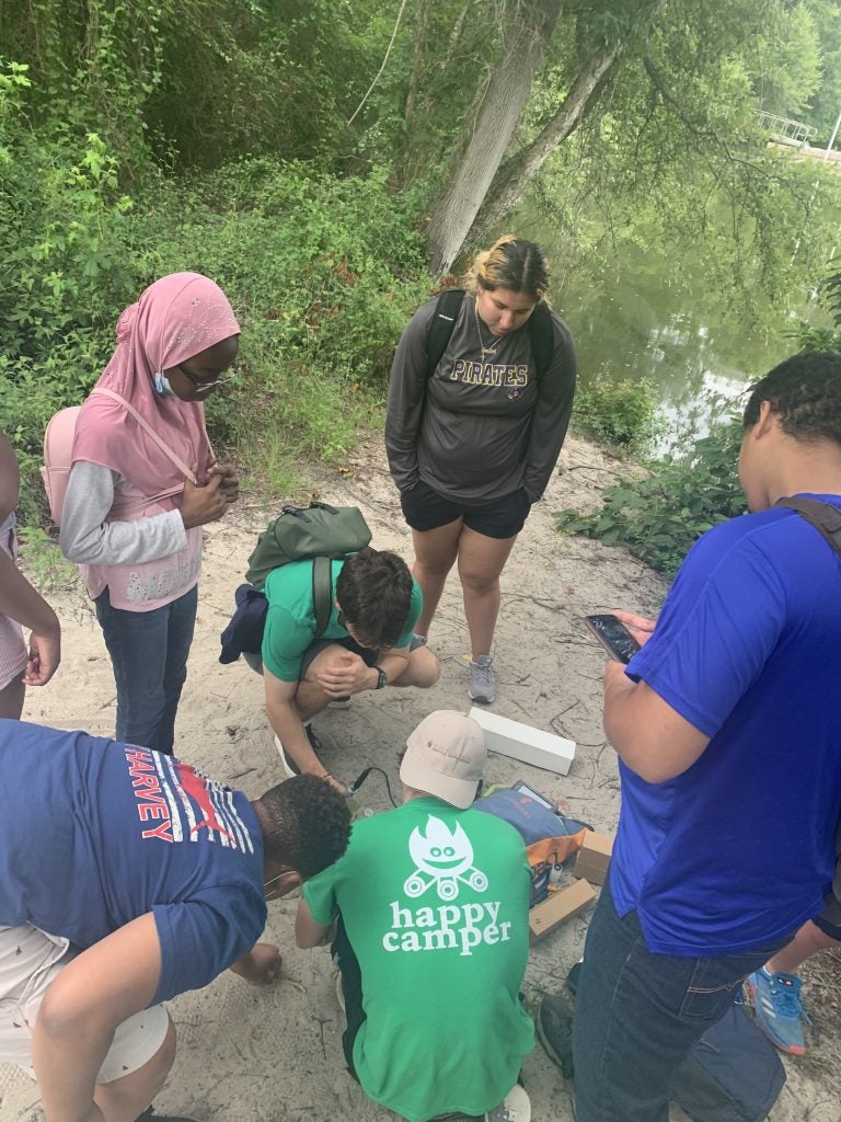
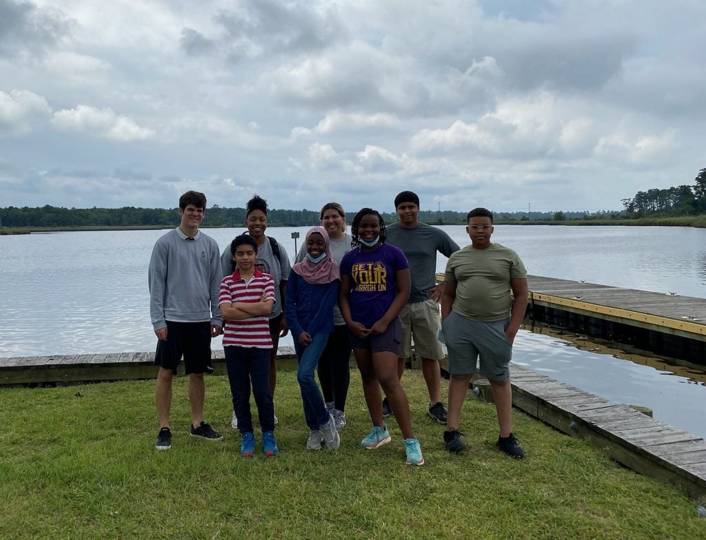
Meet the Participants
Thando
Mariam
Caleb
Jaden
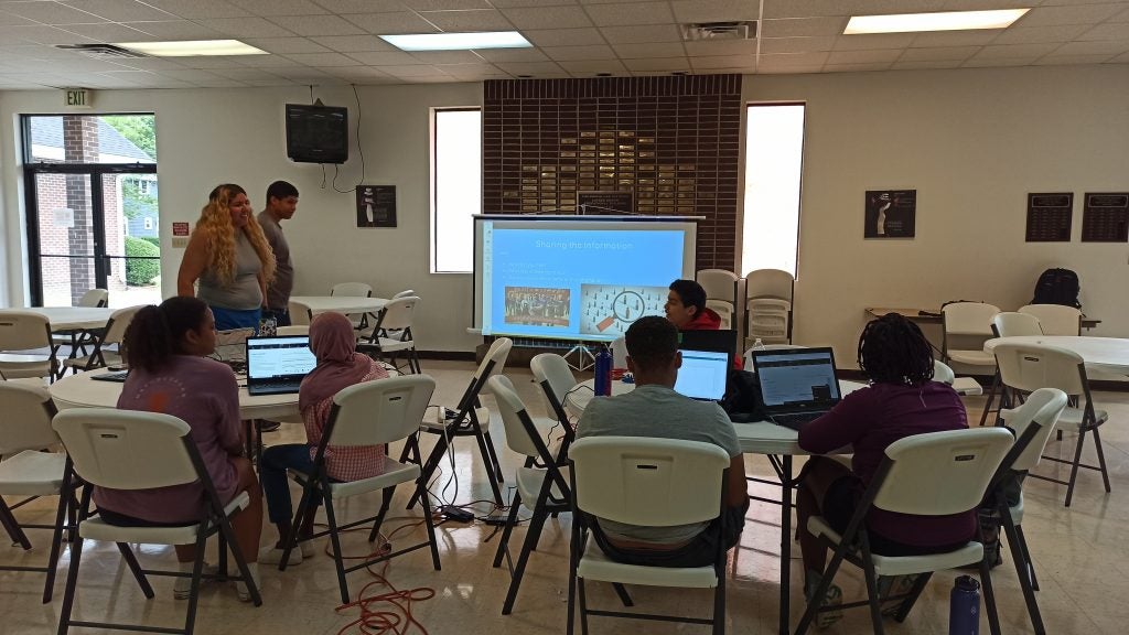
Greenville Projects
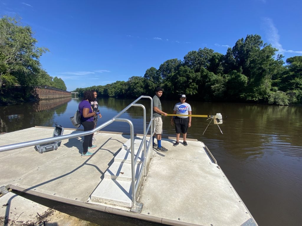
Greenville Water Quality Data Map
Learn how the Water Quality Data Map by clicking HERE.
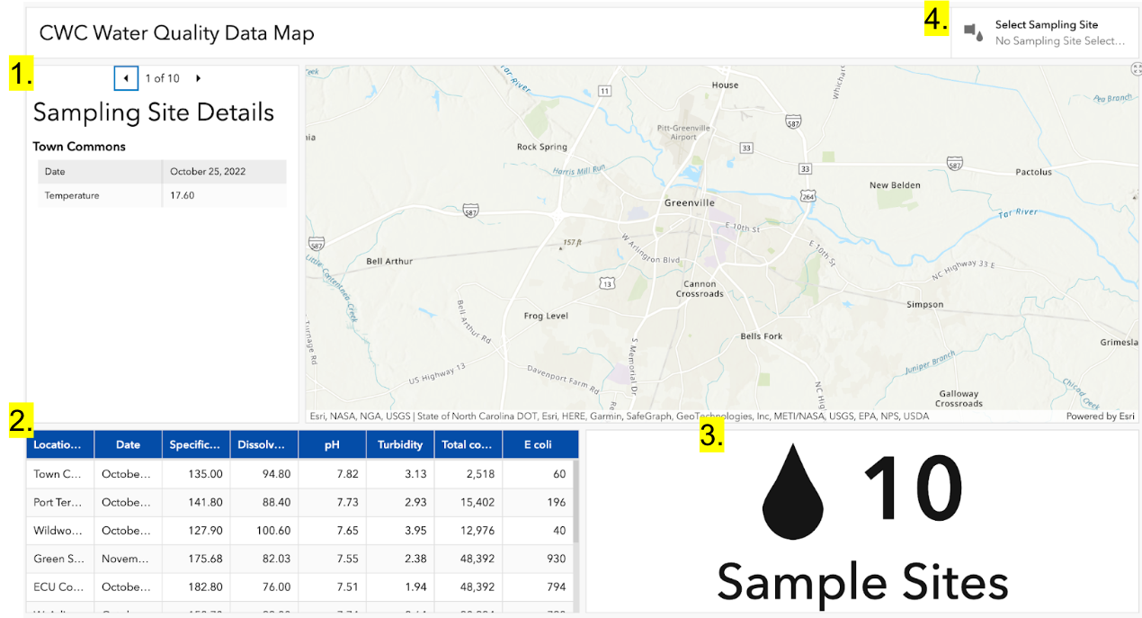
- In the top left is the sampling site details tab. By clicking through the 1-10 at the top, you can see water quality data values at each of the sites and the date data was collected.
- In the bottom left corner of the interface, you can see a table of the different data values collected at each of the sites (column titled location). In case users are interested in specific data values, they may refer to this table for help.
- The figure in the bottom right is the sample site counter. This number shows how many sample sites we have tested around the city of Greenville at one period of time for the map webpage.
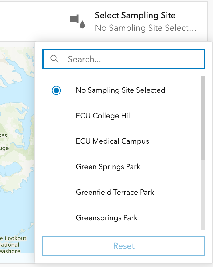
- In the upper right corner of the Water Quality Map, you can see a box titled “Select Sampling Site”. This is the Sampling Site Selector. This button tells you what sampling site you are focused on. If you are still at the entry interface, then all sampling locations should be present in the table and a message saying “No Sampling Site Selected” should show up in the Sampling Site Selector box.
North Greenville Industry and Air Quality Map
Check out the Air Quality Monitoring Map by clicking HERE.
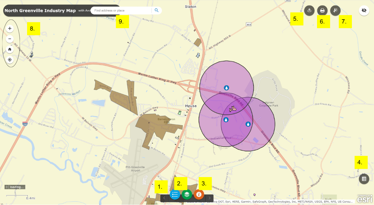
- These are the different components of the North Greenville map. Each option is associated with a set of lines, points, or shapes (polygons) that display information. The Layer List function also allows you to choose what information you want to show with the checkboxes. For example, if you want to see a set of circles around sites of concern, you would check the box titled “0.5-Mile Buffer around Sites of Concern”.
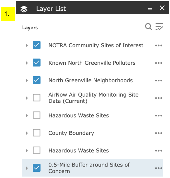
- This is the Legend for the Air Quality map. The colors and symbols help you understand what information is being shown on the map, and so you can refer back to this index if you are confused by any symbols or colors on the map.
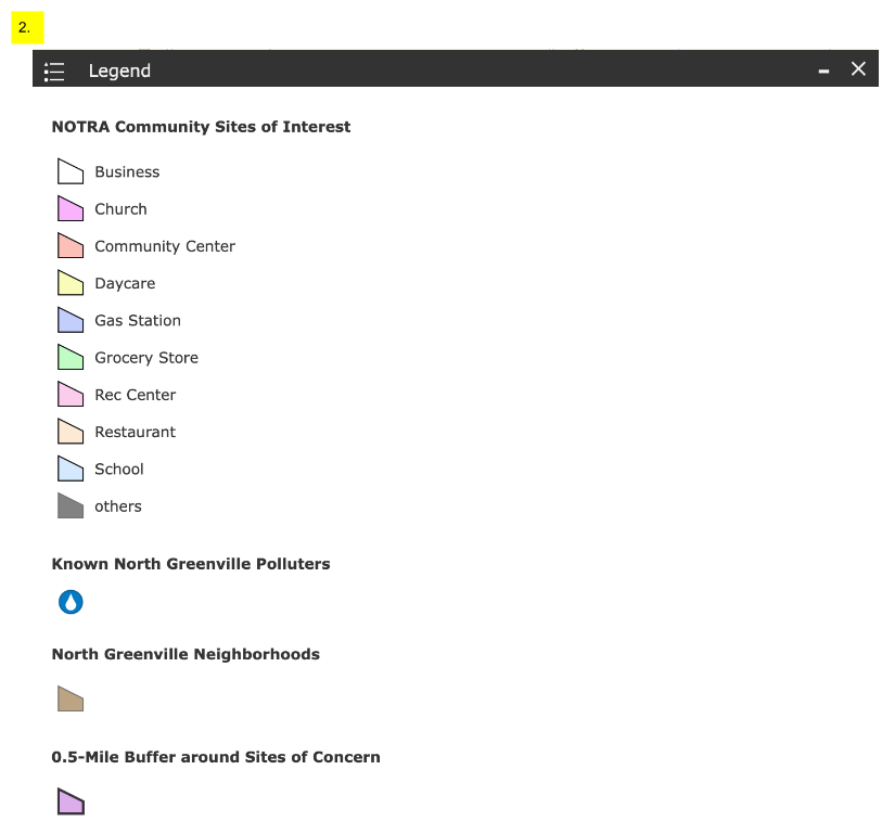
- This is the map disclaimer. This page acknowledges the purpose of the map. It is also important to note that the symbology of the map (its points, lines, and polygons) are largely based on community knowledge provided by NOTRA, and do not accurately reflect levels of pollution or concentration of pollution. This map page serves more as a reference to see how far away community interests are from POTENTIAL polluters and POTENTIAL sources of air pollution.
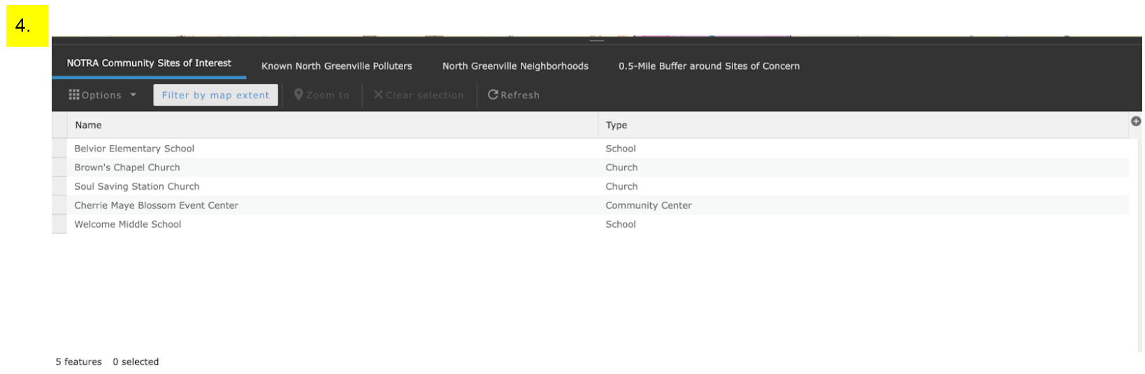
- This is the attribute table for the map. By clicking on the tabs at the top, you can search through the different categories of information that are on the map. The different row entries represents a point, line, or polygon on the map.
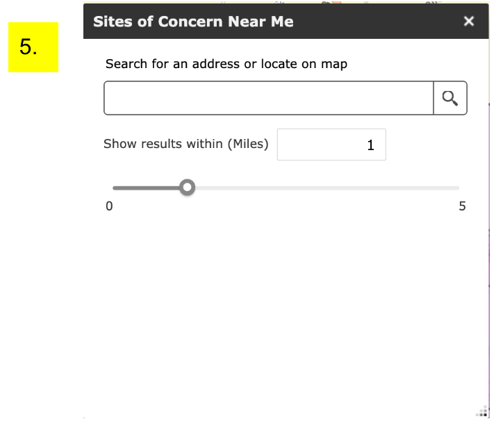
- This is the proximity tool. This tool allows you to look up your address and see what potential polluters are within a given distance away from that point. While the buffer slider starts at a one mile radius, the user can change that distance to whatever they like.
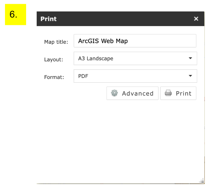
- This is the “Print” function. This function allows you to print off a copy of the map at a view that you have the map at. You can change the format and dimensions of the picture (PNG, JPEG, PDF, etc.) you download to print. This function allows users to print off maps to help community members understand how air quality could be affected spatially and help them plan for air quality monitoring projects.
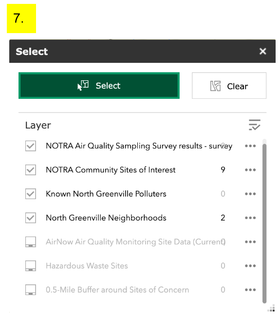
- This is the “Select” function, which allows users to draw rectangles of search areas that “select” all of the polluters, polluter buffer areas, neighborhoods, and NOTRA sites of interest within the given area. This tool will help community members know what important map features exist within a particular area to pinpoint what might be areas with air quality concerns that will require further investigation.
Interactive Drinking Water Quality Infographic
Explore the Water Quality Report by clicking HERE.
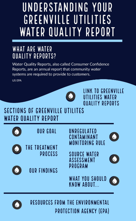
Within the ThingLink application, each of the raindrop shaped buttons provide more information about the section of the Greenville Utilities Water Quality Report that it is correlated with. Extra resources are also provided with this interactive infographic.